Our latest website update: a feast of geodetic data brought to you in bite sized snacks
Our new website has way more guts to do things faster, and this means our team can deliver new and interesting features. The new geodetic data interface (which went live on Monday) is one such feature and is sure to excite our data enthusiastic followers!
If you follow your nose down the ‘Data’ tab on the website, the subtle title ‘Geodetic’ hides a treasure trove of GeoNet’s ground displacement data.
This is where the journey into our new data display starts. Be sure to click on each picture to get higher resoution.
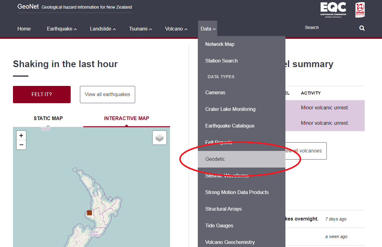
Locating our geodetic data on the website's data tab.
Geodetic data: what’s it good for?
Now, before we get too far into scoping out the data we should tell you what geodetic data is and how it’s measured.
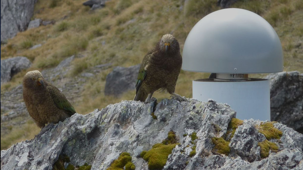
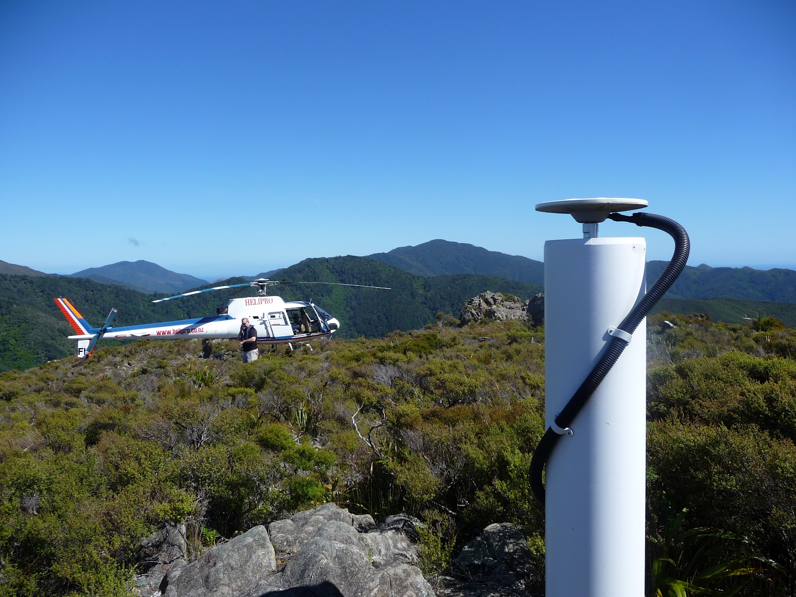
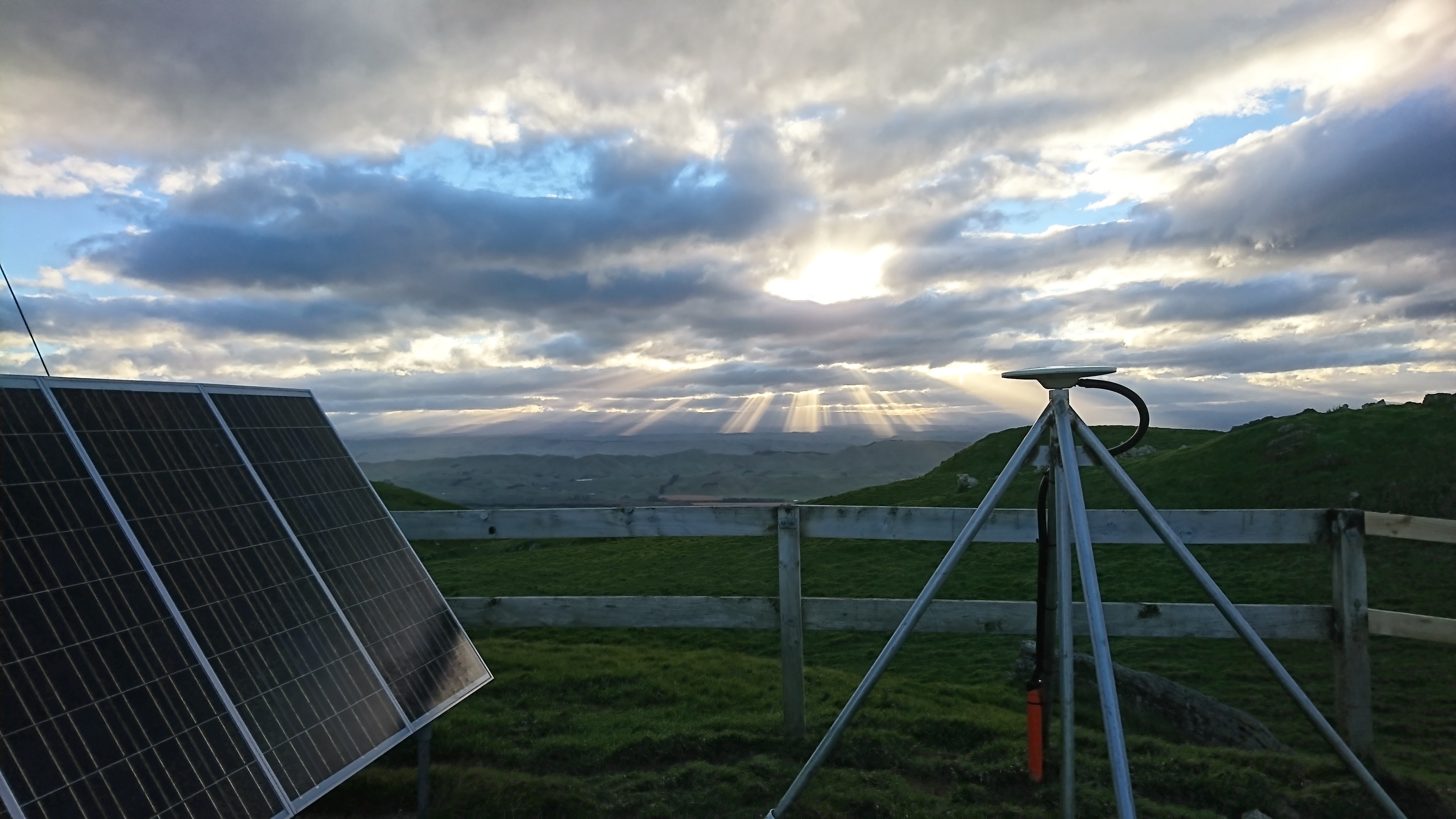
‘Geodesy’ is all about keeping track of the Earth’s shape, so ‘geodetic data’ are often the locations of a point on the Earth’s surface recorded over time. For GeoNet these points are GNSS sensors, ‘flying-saucer’ antenna at our monitoring stations (see below), which record the position of satellites orbiting the Earth up to 10 times every second. By locating themselves relative to the satellites, the GNSS sensors record a continuous stream of how New Zealand is moving. This information, collected across the country, paints us a pretty insightful picture of how the tectonic plates underlying New Zealand are moving - invaluable knowledge for understanding our country and the geologic hazards it hosts!
GNSS site at D'Urville Island
GNSS transmitter at Kahuranaki
Moving deeper into the data tab, once you arrive on the ‘Geodetic’ page you’ll find the brainchild of our GeoNet I.T. gurus: an easy and intuitive way to look at the huge geodetic dataset GeoNet is constantly expanding. With a click of any GNSS sensor (the blue triangles) the ground displacement recorded by that sensor for the last seven years (mid-2010 to mid-2017) will pop up as three plots alongside the map. Cool, right? But what on earth do the plots show, and how should we be interpreting them?
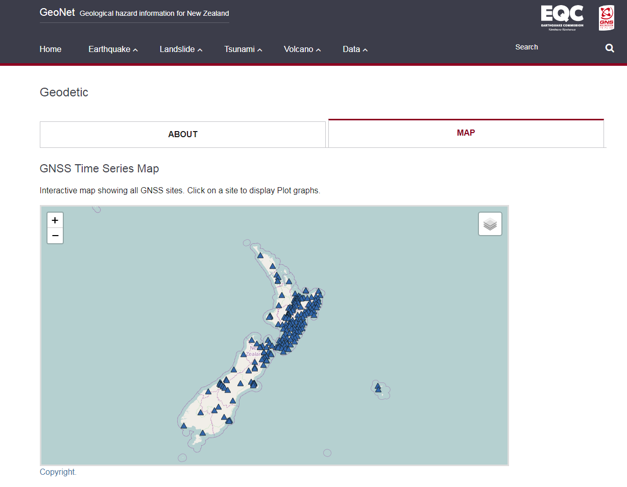
A crafty map created to locate geodetic data collection points across New Zealand.
The ground displacement shown in each data plot is a measure of how the Earth has moved below the sensor relative to the sensor’s average position over the last seven years.
Though shown separately in the three directions, this displacement is actually only in one direction, the North (n), East (e), and Up (u) split happens to make trends in each site’s movement easier to see. Make sure you check out the scales on the left of each plot – some sites might look like they move less because their positions appear to change less over time, but they are just plotted over a larger range.
Trends in these plots highlight the different forms of movement we observe across New Zealand. We’ll run through a few of these now.
Slow slip events
In the ground displacement time series graphs below, slow slip events are shown to occur approximately every 1.5 years on the Hikurangi Plate Margin, as recorded by the MAHI GNSS sensor on the Mahia Peninsula.
The slow slip events punctuate the regular north-westward motion of the peninsula (the decreasing e (mm) and increasing n (mm) trend) and cause the peninsula to move relatively rapidly to the south-east. This motion curbs off after a few months as the slow slip episode ends and the peninsula resumes its day job. These slow slip episodes are benign movements of the Australian Plate over the Pacific Plate and occur along much of the North Island of New Zealand: more info on slow slip events in this area is available here.
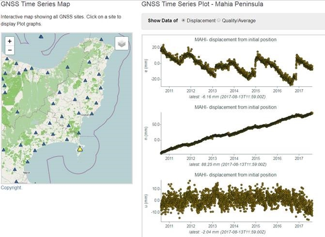
GNSS time series plots indicating slow slip events occuring at regular ~1.5 year intervals over a 7 year period.
Earthquakes
The Cook Strait (late 2013) and Kaikoura (late 2016) Earthquakes recorded at Cape Campbell (CMBL) appear as ‘jumps’ (co-seismic movement) in the ground deformation time series of CMBL. These jumps are followed by a displacement ‘boomerang’ (post-seismic movement) during which the site motion returns to its pre-earthquake state.
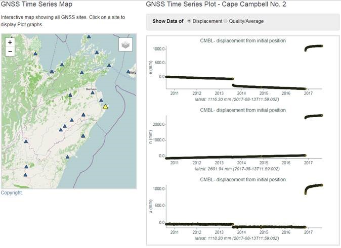
Cape Campbell time series data showing Cook Strait and Kaikoura earthquake events.
Due to the complexity and size of the Kaikoura Earthquake, the post-seismic displacement was great. However, as GeoNet’s monitoring system had limited coverage in the North Canterbury and Marlborough regions at the time of the quake, our ability to capture a record of this displacement was lacking.
Never fear, our techs were near! Within three days of the main shock, our tech teams had deployed several temporary monitoring sites, such as one in Seddon, which allowed us to capture the post-seismic deformation with fantastic clarity. A three-day turnaround is an impressively fast response from our techs, so we reckon a hearty pat on the back and a pint or two are well deserved!
This post-quake data capture has collected interesting information on land deformation for GeoNet and armchair seismologists alike, and our scientists are still building a clearer picture!
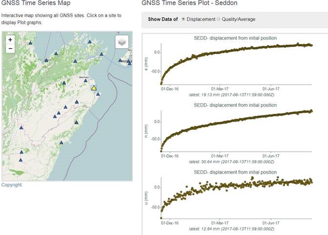
Post-seismic deformation data signals following the Kaikoura quake episode.
Long Term Deformation
As well as capturing the multitude of incredible slip events that occur regularly across New Zealand, the GeoNet geodetic data also tells us about the bigger picture: ‘the motion of Zealandia’, if you will.
Far from the meeting point of the Australian and Pacific Plates, are two sites: KTIA (Kaitaia) and CHTI (Chatham Island). KTIA moves steadily to the north-east, while CHTI moves steadily to the north-west. These two points tell the story of the backbenchers in New Zealand tectonics: that of slow, unyielding convergence between two great tectonic plates.
This is a highly simplified overview, but begins to touch on the extremely complex processes and forces that have formed New Zealand over time and underpin what we see at a surface level (rifts and faults) when an event like the Kaikoura quake occurs.
Australian plate (KTIA)
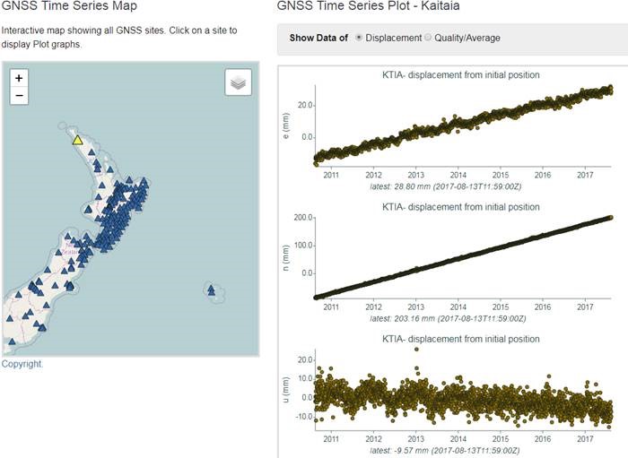
Australian plate deformation dynamics as recorded at Kaitaia GNSS site.
Pacific plate (CHTI)
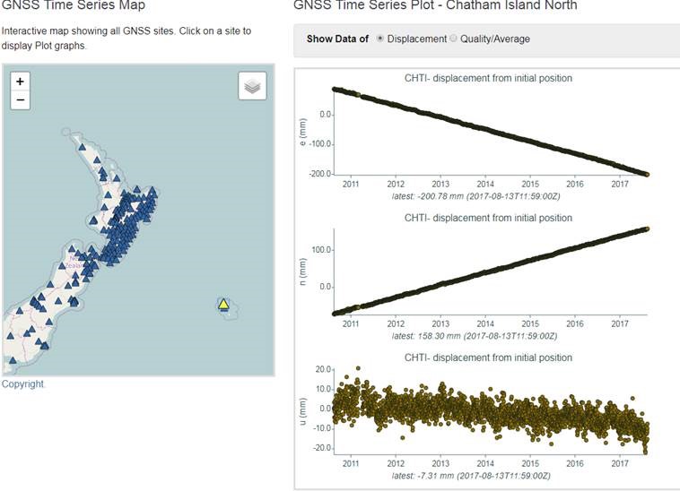
Pacific plate deformation dynamics as recorded at Chatham Island North site.
Landslides
Geodetic time series data can also be used to track land movement and the characteristics of slow moving block landslides, such as the Utiku landslide example here.
Tracking the transformation of slowly slipping landslide events (entirely different from the 'slow slip' plate events described above), means that more proactive management can be taken.
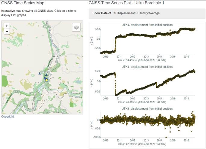
Continuous GNSS data recording allows us to record and monitor the dynamics of slow slipping landslides over time, such as the Utiku landslide..
Volcanic Eruption side effects
Interestingly, even when there’s no surface deformation, GNSS data can be affected by volcanic eruptions, which can provide a trackable, but very random, data signal. This is shown in the plots below and the outliers on the time series (RGWC – Up Component, or the third plot) identify ash from the White Island (Whakari) Eruption during 2016 falling on the GNSS equipment.
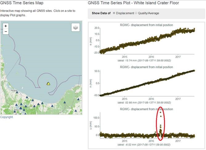
Identifying volcanic effects.
Want to zoom in on the plots or make your own plots? You can through our FITS API.
Instructions are here.