Improving our app for colourblind users
Do you have a colour vision deficiency? We've released an app update making it easier for you use our GeoNet Quake App.
One of the reasons we launched the new colour palette on our app was to make sure that we were building an app that everyone could use. It's likely we have over 12,000 users that have some form of colour vision deficiency or colour blindness (5% of 250,000 users) and our old rainbow colour scheme didn't work well for them. Unfortunately, while we did our research and chose a colour palette that would be distinguishable and meaningful (an increase in colour intensity equals an increase in earthquake intensity) we didn't put enough thought into what maps these icons were overlaid onto. We were putting orange squares over a map with green forest. For some users, these colours are difficult or impossible to distinguish.
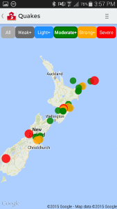
Normal vision of the old rainbow colour palette (unless you are colour blind, then each image pair will look the same). Without knowing, it is impossible to guess if a blue quake is larger than a green quake.
Deuteranopia view. There is no logical progression in the colour scheme as intensity increases. Moderate quakes stand out, and severe quakes blend in with the background map.
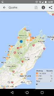
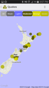
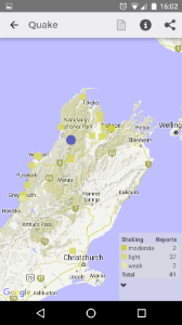
Reported shaking is easy to see for anyone without colour vision deficency.
Deuteranopia view. The orange squares look green and blend in with map's forest areas.
The Fix We went through a few iterations for fixes, and we're hoping our simple solution makes a big difference. We've tested it with a few helpful colleagues, and used a web browser tool that simulates different colour vision deficiencies. For the rest of us, nothing has changed, but colour blind people will be able to turn on 'colour vision deficiency assistance' in the app settings.
The update is available only for our Android beta-testers currently, but depending on the feedback we get, we'll roll it out to all our users including Apple iOS people this month.