Using Our Own Data - RSAM
Welcome, haere mai to another GeoNet Data Blog. Today we are going to talk about RSAM (Real-time Seismic Amplitude Measurement), what it is, why we need it, how we calculate it, and how we use it in our day-to-day work.
Of all the data that GeoNet collects, probably the most well-known is our seismic data that records ground shaking at sites around Aotearoa New Zealand. Our main use for seismic data is to detect and locate earthquakes. Most of the time when we experience an earthquake it causes the ground to shake for a short while and then stops, but what if there was a situation where the ground shaking went on for days or even weeks on end?
Imagine you are sitting beside the Auckland motorway as a continuous stream of traffic goes by, hour after hour. Here the ground shakes non-stop; sometimes a bit stronger than at other times, perhaps when a big truck goes by, but it’s always shaking, and you can always feel it. We can have a situation like this at volcanoes. While the shaking here isn’t strong enough for people to feel, it is loud to our nearby seismographs, and we get a strong record of it in our seismic data. We call this shaking “volcanic tremor”. Volcanic tremor can be caused by movement of gases, magma, or other liquids beneath a volcano, and some styles of eruption also cause volcanic tremor. While our Volcano Monitoring Group can recognise volcanic tremor, it’s not always obvious what causes it.
Volcanic tremor is one of the key parameters our Volcano Monitoring Group uses in deciding the Volcanic Alert Level (VAL) of a volcano. A problem arises with volcanic tremor because it’s not made up of distinct earthquakes, and as our earthquake detection and location system is designed for sharp, sudden shaking, it can’t help quantify how much tremor we have or how strong it is. We need another solution, and this is where RSAM comes in.
RSAM stands for Real-time Seismic Amplitude Measurement. In a nutshell, a RSAM value is a number that represents the average amount of shaking in a fixed time period – we typically use 10 minutes. We take all the data a seismograph records in 10 minutes, average it, and that becomes the RSAM value. This means that we can easily keep track of how much volcanic tremor we’ve recorded with relatively few RSAM values.
Calculating RSAM
We are going to make a short detour to describe how our computer code calculates RSAM. There are probably other ways to do it, and our code isn’t perfect, but this is how we do it. If you are technically minded and perhaps want to calculate RSAM yourself then read on. If you aren’t interested in the details, then skip to the next section. Nothing later relies on this geeky stuff.
We typically retrieve our seismic waveform data from GeoNet’s FDSN webservice, and couple that with Python’s ObsPy library which specialises in working with that type of data. We won’t explain each step in detail, just give a brief outline. Refer to ObsPy’s tutorial and GeoNet’s data tutorials for more details. Using GeoNet’s “archive” or “near real-time” data service, read the requested data into an ObsPy stream object. We request a day’s worth of data. Be sure to grab the response information too.
You’ll notice that we just use the vertical component data, “HHZ”. While horizontal component data give slightly different RSAM values, our experience is that they change in tandem with the vertical component data, so we only work with those. Refer to ObsPy’s tutorial for more information about retrieving data from a FDSN webservice.
client = Client('http://service-nrt.geonet.org.nz')
st = client.get_waveforms(‘NZ’, ’MAVZ’, ’10’, ’HHZ’, start, end, attach_response=True)
# start, end are UTCDateTime variables holding the start and end times of the day of data
Remove the sensor and recorder sensitivity so ground velocity is in units of metres per second (m/s). It’s possible the data stream has gaps. Fill those by interpolating and then merge the streams into a single data trace.
st.remove_sensitivity()
st.merge(fill_value='interpolate')
tr = st[0]
Set up somewhere to store the RSAM values and initialise to zero. One hundred and forty-four storage locations are required for a day of 10-minute observations.
# initialise data array for rsam values
data = np.zeros(144)
Starting from the beginning of the data, we loop through in 10-minute blocks. We prepare each block of data before calculating RSAM. This includes pre-filtering, in this case between f1 = 1 Hz and f2 = 4 Hz. We explain the reason for filtering later in the blog. We calculate the absolute value of the waveform data to avoid negative and positive values canceling, which we don’t want, and we are only interested in the total energy, which does not relate to the direction of the ground motion (the sign). Once we’ve calculated RSAM, divide the value by 10-9 to convert the units to nanometres per second (nm/s). We also discuss this step later in the blog.
t = tr.stats.starttime
index = 0
# loop through data in 600sec (10 min) blocks
while t < tr.stats.endtime:
  tr_10m = tr.slice(t, t + 600)
  tr_10m.detrend(type='constant')
  tr_10m.filter('bandpass', freqmin=f1, freqmax=f2)  # filter
  absolute = np.absolute(tr_10m.data)  # absolute value
  tr_10m.data = absolute  # assign back to trace
  mean = tr_10m.data.mean()  # mean value, effectively this is RSAM
  mean = mean / 1e-9  # convert from m/s to nm/s
  data[index] = mean  # store RSAM value in array called data
  index += 1
t += 600 # advance to next 10 minute block of data
Once we have completed our loop through the data and calculated RSAM for every 10-minute period, we store the values for later use. We store each day’s RSAM data as a miniseed file, though a CSV file containing the time and RSAM value would be easier to work with. We create our RSAM graphs with a separate program from the one we use for calculating the values. This is more efficient as we don’t need to calculate RSAM every time we want to graph it. Instead, we have files of RSAM values we can call on when we want to visualize the data.
How our volcanologists use RSAM
You might be familiar with RSAM graphs on our web site. Our volcanologists refer to these occasionally, but for their day-to-day work they calculate and graph RSAM themselves, and only for volcanoes that have a record of volcanic tremor. In recent years, that’s just Ruapehu and Whakaari-White Island. Here’s a graph showing RSAM at Ruapehu in March 2022. You might recall that from March to June 2022 Ruapehu experienced the strongest volcanic tremor we’ve recorded in the last 20 years. We suggested that the volcanic tremor indicated more volcanic gases moving through the region below the crater lake. The VAL was raised from 1 to 2 and we sent out lots of information about what was happening.
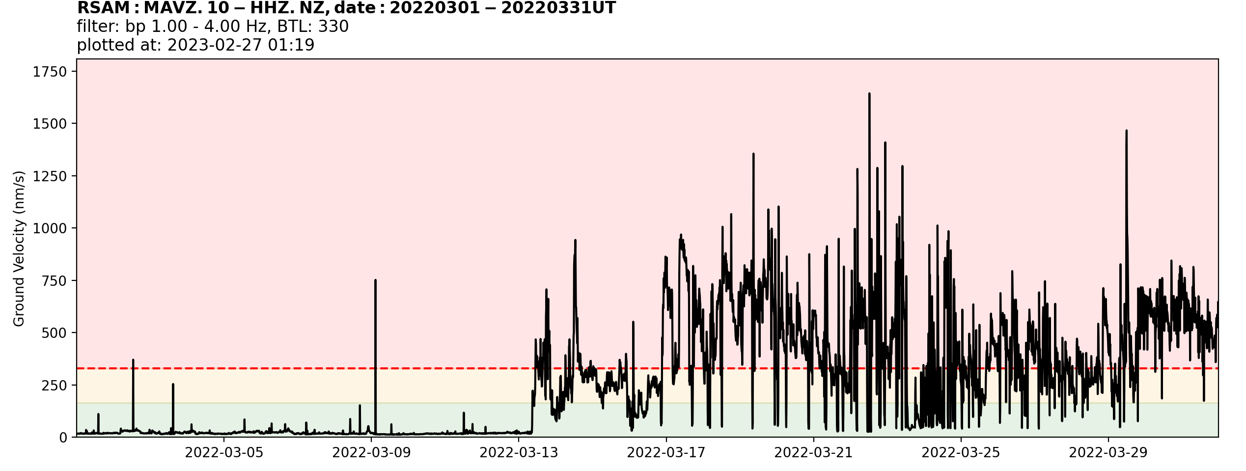
An example of a graph showing RSAM. The data comes from a seismograph on Ruapehu and shows RSAM data calculated for March 2022.
The graph is designed for our Volcano Monitoring Group who are used to looking at graphs like this. There’s a lot of information there so we’ll go through the key parts one by one. By the end we’re sure you’ll be a RSAM expert!
- The graph shows time (March 2022) along the horizontal axis, and RSAM, which we label as “Ground Velocity (nm/s)” on the vertical axis. We’ll explain that label later.
- The black squiggly line shows how the RSAM value changes with time. Notice that it increased suddenly on March 13. You may recall that we said that we use a 10-minute period to calculate the RSAM values. That means we have 144 RSAM values each day, so for March 2023 almost 4500 values are show in the graph.
- Our Volcano Monitoring Group operates a separate automatic alerting system for RSAM. We are notified if three consecutive RSAM values exceed a threshold. That threshold is shown on the graph by the dashed red line. We call it the Baseline Threshold Level (BTL) and for RSAM from this seismograph it has a value of 330. The BTL number also forms part of the title of the graph.
- What about the green, orange, and red colours? A few years ago, we had a situation where one of our volcanologists described certain RSAM values as moderate, and a different volcanologist described the same values as low or high. This was really confusing to our volcanologists and would give very mixed messages to an external audience if different descriptions were included in a Volcanic Activity Bulletin or news story. To avoid this situation, we decided that we’d specify exactly what RSAM values were low, moderate, and high, for the data from each seismograph. We decided that RSAM would be high if it exceeded the BTL (the red dashed line). After all, if we have automatic notification in place for values above the BTL, then surely that means it’s high! Moderate RSAM values are those below the BTL value, but above 50% of the BTL value. Low RSAM values are those less than 50% of the BTL. To make this really clear to the Volcano Monitoring Group we coloured the low region green, the moderate region orange, and the high region red. Just like a traffic light!
- The graph title is really important. It isn’t very pretty, but it gives the Volcano Monitoring Group all the information it needs to understand what data they are looking at. “MAVZ.10-HHZ.NZ” represents the data that was used to calculate RSAM. “MAVZ” is the code for a seismograph close to the crater lake at Ruapehu, so the group’s favourate data source for Ruapehu RSAM. The period of data graphed and when it was plotted are also included for clarity. The label “filter: bp 1.00 – 4.00 Hz” needs some explanation. Volcanic tremor often shakes the ground at a particular rate, at Ruapehu that is mostly between one and four times a second. If we want our RSAM to be a good representation of volcanic tremor, we need to exclude vibrations caused by wind and other sources that shake the ground at other rates. We do that by filtering the ground shaking, to remove all the vibrations that are not between once and four times a second, before we calculate RSAM. It’s not perfect and doesn’t guarantee that only volcanic tremor contributes to the RSAM values, but it’s pretty good. That filtering before calculating RSAM is what “filter: bp 1.00 – 4.00 Hz” means.
- Finally, what about the label “Ground Velocity (nm/s)” on the vertical axis of the graph? Seismographs typically record the velocity, or speed, of ground shaking. We are all familiar with speed from driving our car, riding our bicycle and the like. The typical urban speed limit of 50 km/h (kilometres per hour) is about 14 m/s (metres per second). The velocity of ground shaking caused by volcanic tremor is a lot less. At Ruapehu in March 2022, the seismograph at MAVZ recorded a maximum RSAM of just over one one-millionth of a metre per second (0.000001 m/s). That’s incredibly hard to get your head around, and dealing with numbers much smaller than one doesn’t make the labels on a graph easy to read. We solved that by labeling the graph with the number of billionths of a metre per second (0.000000001 m/s). Whoa, hold on, surely that’s even more hard to understand? Well yes, but the advantage of using billionths of a metre per second, which we call nanometres per second (nm/s), is that the RSAM numbers are all typically in the 10s to 100s range, or in extreme cases 1000s, of nm/s, which are familiar numbers for us to work with and so make the vertical axis labels easier to read, and therefore the graph itself, easier to understand.
The “look and feel” of the RSAM graph is something that needs to be explained. The graph is “static”, by which we mean we can’t zoom in/out, pan, or hover over points on the graph and show the actual values. In some situations an interactive graph that allows these things would be helpful to the Volcano Monitoring Group, but at the moment the software the group is using to view their monitoring data doesn’t permit interactive graphs.
The Volcano Monitoring Group use this and similar graphs for data exploration. This means they are a primary resource for tracking and understanding the volcanic data, and looking for “significant features” in the data. Most of the “technical labels” on the graph we’ve explained are there to make sure our volcano experts have all the information they need to explore these data. If we use a RSAM graph in a Volcanic Activity Bulletin or news story then we won’t, or at least shouldn’t, include all the technical stuff and we’ll focus more on the message that we want the graph to convey.
RSAM as a data set
Like our Volcano Monitoring Group, technical data users can calculate RSAM themselves. But non-technical users will usually find it too difficult to deal with the original seismic data and the software necessary to work with those data. For this reason, we intend to make RSAM data available alongside the other data we provide. When it’s completed, you‘ll be able to find data through our Tilde Data Discovery GUI. We’ll be sure to let you know when it’s available.
That’s it for now
So, there you have it. All about RSAM and how we use it as part of our volcano monitoring. We hope you’ve enjoyed a look behind the scenes at how GeoNet works with some of the data we collect. For the moment, this is the last of our blogs looking at how we use our own data, but we might come back to this topic if we have some good ideas. You can find our earlier blog posts through the News section on our web page just select the Data Blog filter before hitting the Search button. We welcome your feedback, and if there are any GeoNet data topics you’d really like us to talk about, please let us know! Ngā mihi nui.
Contact: info@geonet.org.nz