National Advisory: Tsunami activity – expect strong and unusual currents and unpredictable surges at the shore following the M8.8 earthquake, Kamchatka Russia. For all information please visit NEMA (The National Emergency Management Agency) Only messages issued by NEMA represent the official warning status for New Zealand.

Viewing Data in Spreadsheets
Welcome, haere mai to another GeoNet Data Blog. Today’s blog is about how you can visualise data in spreadsheets.
We know that for many in our data user community spreadsheets are the go-to solution for data storage, analysis, and viewing. However, spreadsheets can quickly become overloaded with data making them hard to work with and patterns in the data difficult to spot.
Rather than trying to understand the data through painful and sometimes disorienting manual comparisons across columns and up and down rows, we often use graphs to explore data relationships and inform our analysis. But if we have many columns in our spreadsheet our data exploration can become equally confusing and difficult as the number and complexity of the graphs required becomes unwieldy. We may find we have too many graphs (as in the case of one graph per column) or a few very busy graphs each showing several columns of data. So, by using graphs we might find we’ve eliminated one problem and replaced it with another!
In this blog we are going to illustrate a couple of ways we can use a spreadsheet to view data without lots of graphs and over taxing our brains. We’ll use a dataset from Tilde, our low-rate data delivery application, and specifically one collected relatively infrequently as those datasets suit the methods we will illustrate.
The two methods we are going to use are sparklines and heatmaps. We will illustrate our examples using LibreOffice Calc, but Microsoft Excel and Google Sheets can achieve the same results.
The data
We will use gas emission (flux) data from Whakaari/White Island volcano from 2024 to mid-2025, measured while flying near the volcano. The dataset consists of emission rates of three gases, carbon dioxide (CO₂), hydrogen sulphide (H₂S), and sulphur dioxide (SO₂) measured at different points in time. For this time period, the CO₂ and H₂S observations were measured in only one way, but SO₂ in three different ways, and we’ll want to distinguish between those.
To prepare data for a spreadsheet, we used a modified version of part of the data-tutorial on how to access and view manually collected volcano data, specifically the part that creates spreadsheet-like output. This is what our basic dataset looks like. Date in the first column and one column for each of the gas emission rates.
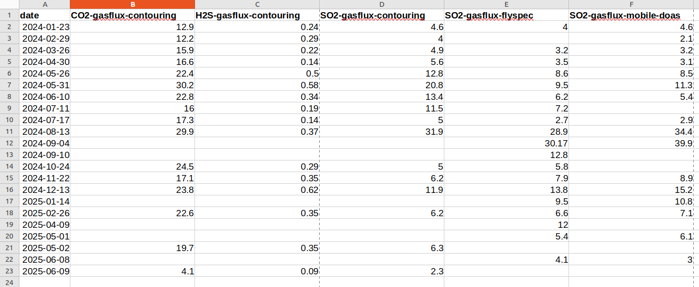
Our dataset. Each column represents emission rates (fluxes) of gas measured at Whakaari/White Island. Sulphur dioxide (SO₂) is measured using three techniques. Empty cells indicate no data were collected using a technique on a particular day.
The kinds of questions someone analysing this data might ask are: when were gas flux values high, when were they low, and does a high CO2 value coincide with a high or low SO2 value? These are not easy questions to answer just looking at a spreadsheet of values: cue sparklines.
Sparklines
Think of a sparkline as a line plot without axes or labels where it is just the variation in value across a series of cells that is being shown. It is not very useful for any kind of detailed analysis, but as a supplement to a row or column of data in a spreadsheet helps us understand trends in data.
In LibreOffice Calc, you can add a traditional sparkline by clicking on Insert – Sparkline, then selecting your input data, output cell for the sparkline, line as the graph type, and then configuring line width and colour, etc. In Microsoft Excel, you click on Insert – Line (in the Sparklines group) and then configure your line in the same way. Sparklines are not currently supported in Excel Online. In Google Sheets, a sparkline is a function, so you click on Insert – Function – Google – Sparkline, then select your input data. You can configure the line by adding extra parameters to your function call.
LibreOffice Calc, Microsoft Excel and Google Sheets also offer bar sparklines instead of the line type, though in Google Sheets the type called column. We also added that to our spreadsheet. This is what we got.
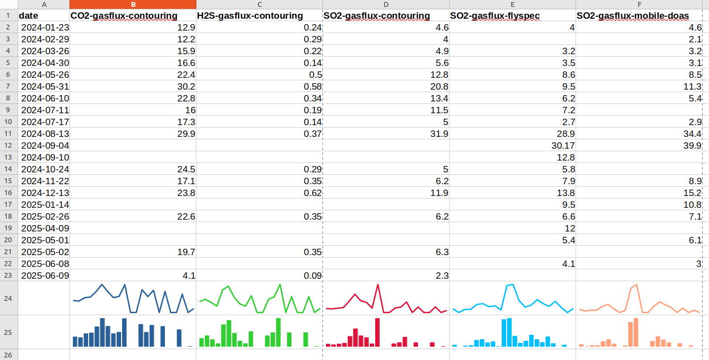
Our dataset with the addition of a traditional line sparkline in row 24 and a bar sparkline in row 25. We increased the size of cells with sparklines so the sparklines themselves were slightly larger.
We think you’ll agree the trends in each data column are easier to see when sparklines are added. Take the “SO2-gasflux-flyspec” column E for example, high values in rows 11 and 12 translate into the sparkline going up near the middle and higher bars in middle of the bar version, something that is quickly obvious. As some of the cells in our spreadsheet have missing values (no observations), the bar option possibly works better than the line in this case, but it’s really personal preference.
Heatmaps
In a heatmap the colour of a cell is set based on the value in that cell. It’s a bit like a relief map in an atlas where different heights have different colours.
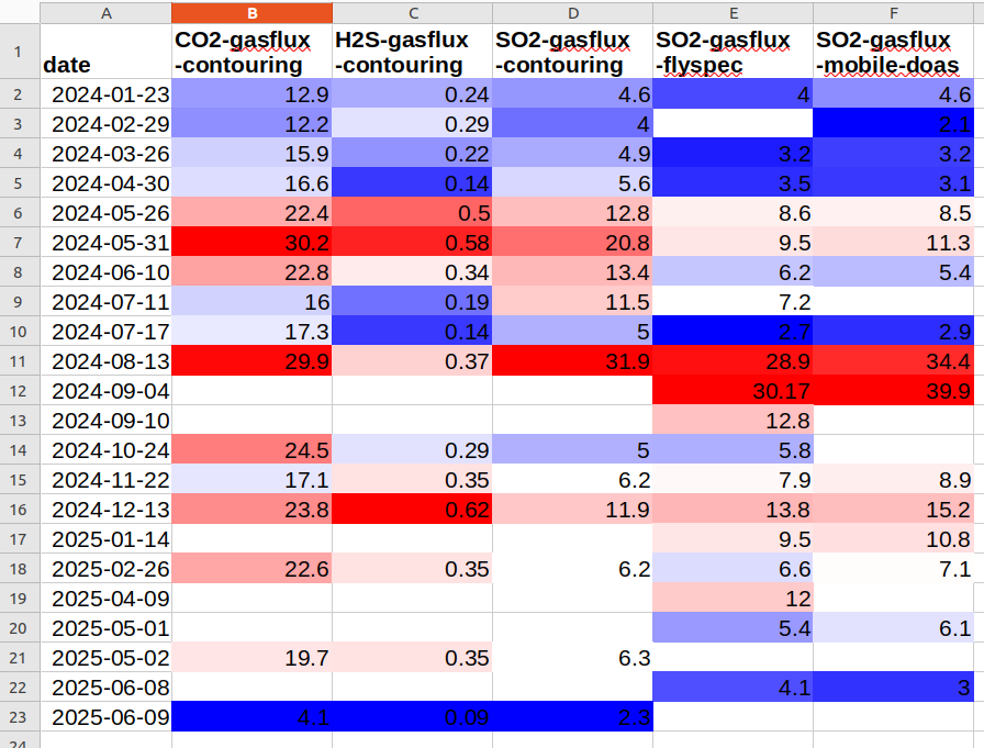
Our dataset with the addition of a heatmap to each column separately. Blue is low values, white values near the median (middle value), and red high values. Cells with missing values have no colour so show as white.
You can apply a heatmap to a single row or column, or to multiple rows and columns, depending on what you want to show in your data. The figure above is what you get if you apply a blue-white-red colour scheme to each column separately. Blue is for low values, white for values around the median (middle value) of the data column, and red is for high values. One issue is that missing values are given no colour which looks white and may be confused with a near-median value, but as there are no numbers in those cells it shouldn’t be too confusing.
In LibreOffice Calc, you can add a heatmap by selecting the cells you want to include, clicking on Format – Conditional – Color Scale, and then selecting how the values will map to the colours you chose.
In Microsoft Excel (and the online version), select the cells you want to include, then from the Home tab click on Conditional Formatting (in the Styles group), and chose one of the predefined “Color Scales”, which you can later modify if you wish. In Google Sheets, select the cells you want to include, click on Format – Conditional formatting – Color scale, and then select how the values will map to the colours you chose.
Depending on your data and the colours you want to use, some experimentation will probably be needed to get something that helps show changes in the data and is pleasing to the eye. There are a number of things to think about when deciding your heatmap colours, but that will have to wait for another blog.
Here is what you get with the same colour scheme applied to all five columns of gas emission observations. As the low, median (middle value), and high values are for all columns of data, the H₂S emissions are all coloured blue as H₂S emissions are lower than CO₂ and SO₂ emissions. This might or might not be what you want to show.
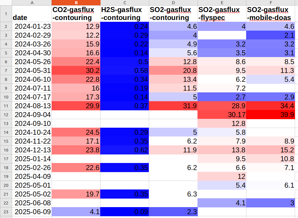
Our dataset with the addition of a heatmap applied to all columns together. Blue is low values, white values near the median, and red high values. H₂S emissions are lower than CO₂ and SO₂ emissions so their cells are coloured a dark shade of blue.
That’s it for now
If you are a big spreadsheet user, we hope you found this useful. If you create or store your data in a spreadsheet and later want to share it with others here are some practical recommendations to help you in that.
You can find our earlier blog posts through the News section on our web page, just select the Data Blog filter before hitting the Search button. We welcome your feedback on our data blogs and if there are any GeoNet data topics you’d like us to talk about please let us know!
Ngā mihi nui.
Contact: info@geonet.org.nz