Using Our Own Data – Fumarole Temperatures
Welcome, haere mai to another GeoNet Data Blog. Today, we have the first in a short series of blogs looking at how GeoNet uses some of the data we collect. We are going to talk about fumarole temperature data, what it is, how we use it, and how we present it for use in our day-to-day work.
Many budding volcanologists will have heard of fumaroles. They are steam and gas vents that you find on some volcanoes. Volcano chemists have a thing about fumaroles, and it wouldn’t be too much of a stretch to say that they consider fumaroles as a view into a volcano’s heart. One of the main things volcano chemists like to do at fumaroles is collect the gases they emit, and then analyse them in a laboratory to infer what is happening in the volcano’s “plumbing system” beneath. When they can’t do that, a fumarole’s temperature and how it changes is the next best thing. It’s that fumarole temperature data, specifically data GeoNet has recently started collecting automatically, that is the focus of today.
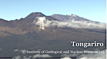
An image from one of our webcams showing the Ketetahi fumarole on Mt Tongariro on a cold and relatively still morning in April 2023. Steam and gases rise from the fumarole and are gently blown to the right of the image. Mt Ngauruhoe and Mt Ruapehu are in the background. The view is a crop of a full-size image to better shown the Ketetahi area.
You can learn more about webcam images and how you can use them in an earlier blog.
Using fumarole temperature data
As mentioned, analysis of gases emitted from fumaroles is “gold standard” data for volcano chemists. However, to collect these data they have to head up to the fumaroles themselves. Getting there can be expensive and is restricted by weather and volcanic activity. This is where automatically collected temperature data are so valuable: as long as temperature sensing equipment is in a fumarole, we can get data 24/7. This allows us to observe fumarole temperature changes that might occur before an eruption – changes that might be missed if we were relying solely on temperature or gas chemistry data collected when someone visited a fumarole.
Showing fumarole temperature data
Fumarole temperature data are an example of what we call a “time series”. The same observation is made repeatedly and forms a series of observations that are ideal for showing changes over time. Here are the temperature data from a fumarole on the top of Mt Ngauruhoe. For volcano observations, this site can only easily be accessed using a helicopter, is frequently inaccessible due to poor weather, and would be impossible to access during even minor eruptive activity at Mt Ngauruhoe. Temperature is the only “continuous” observation we currently make at that site.
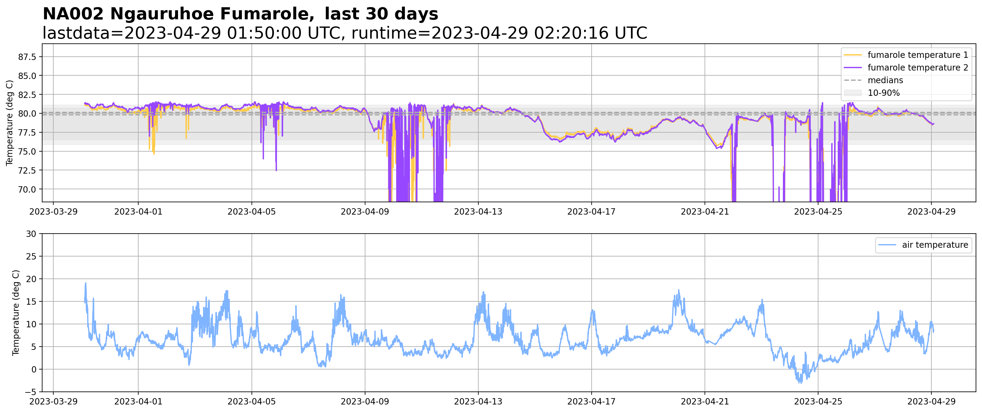
Graph showing fumarole temperature from a site near the summit of Mt Ngauruhoe for the 30 days to 29 April 2023. The upper plot shows temperature measured by two sensors, with some data evaluation “helpers”. The lower plot shows air temperature measured nearby.
Key features of the fumarole temperature graph
Here we will work through aspects of the graph, explaining what is shown, what it means, and how it is used. The purpose of the fumarole temperature graph is to give GNS Science’s Volcano Monitoring Group (VMG) a resource to evaluate any changes in fumarole temperature. The data themselves are held in Tilde, GeoNet’s low-rate time series database, and available through our data discovery GUI. An advantage of this graph over the data discovery GUI is that it provides some data “helpers” to assist in evaluating temperature changes. As the graph is primarily a data exploration tool for the VMG, we also include grid lines and some technical labels that we wouldn’t include on a graph used for public messaging.
The two lines above the upper graph are the title. They make sure the VMG doesn’t confuse this graph with a similar one from another fumarole and provides other useful information:
"NA002" is the code use for the fumarole monitoring site; “Ngauruhoe Fumarole” is the site name; The time-period covered by the graph is the “last 30 days”.
The second line shows the time of the last data values on the graph, labeled “lastdata”, and the time the graph was made, labeled “runtime”. “UTC” means “Universal Time”, which is 12 hours behind New Zealand Standard Time, and the time zone GeoNet uses to collect all of its data. We show both lastdata and runtime so that the VMG can quickly check if data haven’t been retrieved from the site for a long time. The graph is created every four hours.
The upper graph shows temperature measured at the fumarole. With data such as these, the VMG favours detailed content as it helps with critical evaluation of trends and changes. For this reason, the graph might appear a little “noisy”, including overlapping traces and guides to data ranges. Here are the main features of the graph:
There are two thermocouples (a special type of thermometer) permanently inserted into the fumarole recording temperature. The temperature from each thermocouple is shown by a different line colour. Each thermocouple doesn’t record the same temperature as they are in slightly different positions in the fumarole.
The gray dashed lines show the median temperature value from each thermocouple. These medians are good estimates of the “average” temperature value over the last 30 days.
The grey shaded region labeled “10-90%” marks the temperature range containing 80% of the observations (90% - 10% = 80%). The 10-90% regions give the VMG an idea of how much variability we’ve observed over the last 30 days, and whether any recent change is outside this range. Do they need to think about what might have caused this change, or it is just “normal, everyday variability”?
As there are two thermocouples, we have two 10-90% regions and two median lines. As we don’t have a lot of experience with what are important changes in temperature at this fumarole, as Ngauruhoe last erupted in 1975, the VMG can’t set any sensible “trigger values” for response actions. The medians and 10-90% regions partly serve this purpose.
You might be wondering how we set the temperature range of the graph’s vertical axis – some of the values are off the chart! We want it to have a range which best shows how temperature changes over time, but we don’t want to show extreme values as, so far, they don’t represent good observations of fumarole temperature – more on that later.
We use the 10% and 90% values for the data we mentioned earlier to help set the high and low axis limits. Specifically, we multiply the 10% value by 0.9, making it smaller, and the 90% value by 1.1, making it larger. The choice of 0.9 and 1.1 as multipliers is so far a little arbitrary, and we might adjust this as we learn more about the fumarole temperatures data. We get a vertical axis range that shows most of the data in the last 30 days and is automatically adjusted by new data values each time the graph is made.
The extreme low values on the graph deserve a few words:
- We are confident that they don’t represent realistic observations of the steam and gases rising to the surface at the fumarole, as it’s not realistic for the temperature to drop from about 80oC to below 70oC, and then quickly return to the higher value. As the pressure of steam and gas coming out of the fumarole is relatively weak, we think that during windy weather cool air is blow down into the fumarole and displaces and dilutes the steam and gas and cause the thermocouples to measure low temperatures uncharacteristic for the fumerole. One word for this kind of observation is “outlier”. These outliers are not currently flagged as such in our Tilde database and will appear undistinguished in any data requests.
The lower graphs show the air temperature recorded at the site. These data are helpful to check if changes seen in the fumarole temperature data might be influenced by changes in the local weather.
The fumarole temperature data set
The fumarole temperature data are one of the new environmental data sets we have recently begun collecting. They are recorded every 10 minutes and sent to our data centre each hour. The easiest way to access these is through our Tilde Data Discovery GUI where you can explore and download any data you might want to investigate.
That’s it for now
That ends our brief look at fumarole temperature data. In the future, we hope to write a few more blogs looking at how we use our own data. As fumarole temperature collected this frequently is still relatively new for us, we might revisit it sometime in the future. You can find our earlier blog posts through the News section on our web page, just select the Data Blog filter before hitting the Search button.
We welcome your feedback, and if there are any GeoNet data topics you’d really like us to talk about, please let us know!
Ngā mihi nui.
Contact: info@geonet.org.nz