
Visualising Historic Volcanic Activity at Tongariro
Welcome, haere mai to another GeoNet Data Blog. Today we look at different options for visualising categorical time-series data using the record of historic volcanic activity at Tongariro.
Late in 2021, we published a news story highlighting historic volcanic activity data for Ruapehu and Tongariro volcanoes. In that story we showed where on Tongariro activity had been documented since 1846 and noted that the activity at Red Crater was greater than had previously been thought.
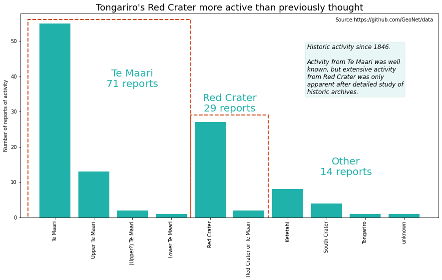
A graphic showing where historic activity has been documented at Tongariro from our news story in late 2021. The idea was to highlight that although the Te Maari craters have had the most activity, Red Crater was more active than scientists knew before collating the data.
While that is a nice graphic and clearly shows the activity at each of the craters or vents on Tongariro, it ignores the time component. In real-life situations you often can’t show every aspect of a data set in a single graphic. To do so would make it confusing to all but the person who drew it! The solution is to pick your main messages and visualise your data in ways that best convey those. If that requires you to create more than one graphic, so be it.
Before we focus on the time component of the data, we want to give you a different option to what we put in the news story. It’s called a treemap and uses the area of a rectangle to represent the quantity being described. Here we use it to visualise the three main location groups
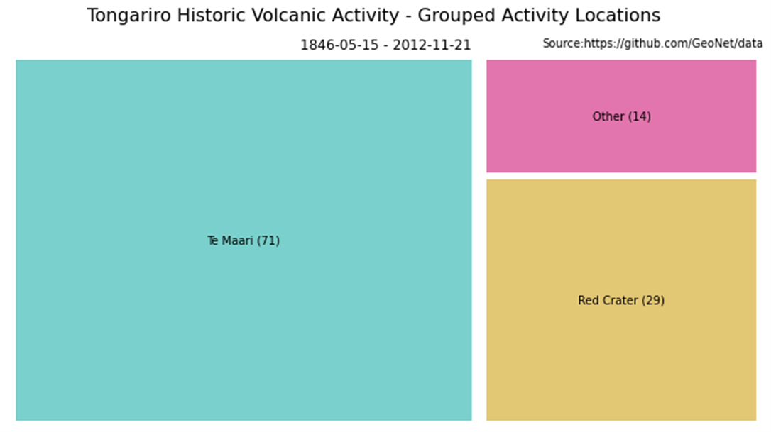
A treemap visualisation showing the relative proportion of activity from different craters or vents on Tongariro. The figures in brackets are the total number of documented events in that location.
Strictly, treemaps are used for hierarchical data, where there is an “above”, “below”, or “same level” relationship between the data. For our grouped locations - Te Maari, Red Crater, and Other there isn’t, but it still gives a good visual representation of the proportions. If you want to compare exact numbers, then the bar chart we used in the news story is easier for our eyes and brain as we can distinguish relative heights more easily than relative areas.
Time component of the data set
Let’s look at the time component of the Tongariro data. When we want to visualise something that varies with time we typically have a time axis, usually the horizontal or x-axis, and the vertical or y-axis shows the number or quantity that varies over time. Let’s take a quick look at a small section of the Tongariro data, for simplicity we’ve eliminated all but the time and location of activity as they are the key parameters we want to graph.
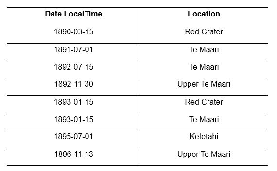
Data
The Date LocalTime column is when activity was described, and the Location column where the activity is thought to have occurred. The location is an example of what we call categorical data. That means the value can be one of only a limited number of options. In the Tongariro data set, the location of described activity is always one of "Te Maari", "Upper Te Maari", "(Upper?) Te Maari", "Lower Te Maari", "Red Crater", "Red Crater or Te Maari", "Ketetahi", "South Crater", "Tongariro", or "unknown". You’ll notice that the categories aren’t as tidy as we might like, but this is real data, and we just have to deal with what we have!
This is how we chose to visualise these data. Time is on the x-axis, on the y-axis we have each of the location categories in alphabetical order from top to bottom.
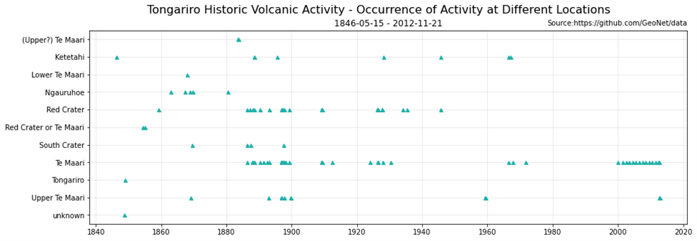
An example of visualising how volcanic activity at Tongariro varied with location over time. Locations are in alphabetical order.
To make this graphic we need to assign a y-axis value to each record in our data set. There are 11 possible locations of activity, so we set the y-axis value for “(Upper?) Te Maari” to 11, “Ketetahi” to 10, …., and “unknown” to 0. This is now our data table.
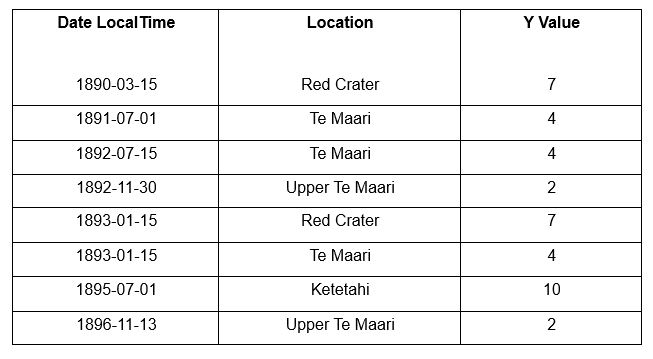
Data
Next, we simply plot a symbol at every time and location of documented activity, for example, at x=1890-03-15 and y= 7 and at x=1891-07-01 and y=4. Then we need to label the y-axis with the location names rather than numbers. Add a title and any other information and we’re done. If you are interested, we used the same method to construct time-series plots in our blog on the earthquake catalogue.
So, how is this graphic useful?
What can we learn from it that we can’t from the one in the news story? Well, we can see what locations on Tongariro were active during a particular time interval. In this case we’ve chosen to highlight the period 1880-1900 when Tongariro was particularly active. We see that activity was reported from Te Maari, particularly Upper Te Maari, as well as South Crater, Red Crater, Ketetahi, and even one report from Ngauruhoe. Whether all of those locations had activity or whether some observers misidentified the source of activity is not something we can answer. If you want to dig into those details further, we recommend looking at the original report describing the results.
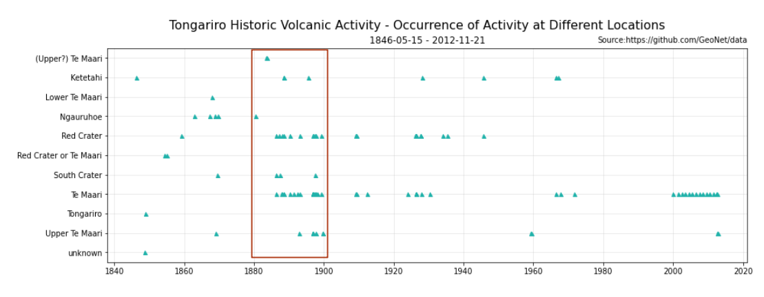
Visualising how volcanic activity at Tongariro varied with location over time and highlighting all the locations with reports of activity between 1880 and 1890.
The other way you can view this graphic is to run your eyes from left to right for one or more locations of activity and get an impression of how activity at that crater or vent has varied with time. We’ve chosen to highlight Red Crater, Te Maari, and Upper Te Maari as they have been the most active.
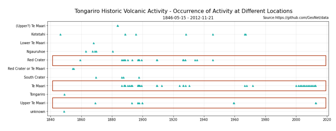
Visualising how volcanic activity at Tongariro varied with location over time and highlighting all reports of activity from Red Crater, Te Maari, and Upper Te Maari.
While that looks pretty neat, it lacks numbers, how many reports were there from Red Crater, how did they vary with time, and how does Red Crater activity compare with the other two highlighted locations? A nice way to show that information is to plot the cumulative number of activity reports. The first activity report is numbered 1, the second 2, and so on, and we plot a curve of the activity number with time. The only thing we do which is a little different is that we make a step plot, like we explained when we talked about the volcanic alert level data set.
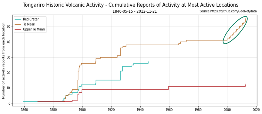
Visualising how volcanic activity at Tongariro varied over time at the most active locations - Red Crater, Te Maari, and Upper Te Maari. Some reports of activity at Te Maari that represent earthquakes rather than steam, gas, or ash discharge are outlined.
We think this illustrates the variation in activity quite well. You clearly see that activity at Red Crater was last reported in the 1940s, and that the number of reports of activity specifically identified as coming from Upper Te Maari has been fewer than from Red Crater and Te Maari in general.
You can see we’ve outlined a series of reports of activity from Te Maari starting in 2000. In contrast to the other reports in the data set, these refer to earthquake activity, not to steam, gas, or ash seen above the craters. Including this earthquake activity in the catalogue was a decision made by the scientists you did the research. If you want more information, take a look at the original report.
That’s it for now
As you can see, showing time variations superimposed on categorical data is a bit different from a typical time-series visualisation. You can apply some of the ideas discussed here to other data sets, and we may do that in another data blog some time. You can find our earlier blog posts through the News section on our web page just select the Data Blog filter before hitting the Search button.
We welcome your feedback, and if there are any GeoNet data topics you’d really like us to talk about, please let us know! Ngā mihi nui.
Contact: info@geonet.org.nz