A Visually Impaired Perspective on Mapping Colour Schemes
For those of us who can’t tell the difference between pink and red, red and green – a predicament many kiwi lads (and ladies) find ourselves in – the concept of a rainbow coloured intensity scale is a slippery one.
A question that has been asked of us at GeoNet by people who have colour vision deficiency and colourblindness include: is grey-green higher intensity shaking than green-grey or vice versa? Although tongue-in-cheek, in terms of visual practicality, our previous rainbow colours were a bit of a fail.
Since our updated website became live on 1 June, we’ve been reading all your feedback. Many of you don’t like that we got rid of the rainbow colour scheme from the quake maps. Admittedly, it’s taken me a bit to get used to the colour palette. The rainbow scheme was just so pretty! But most of us aren’t colour blind and can handle all that rainbow. However, the modifications are for good reason, so let's break it down for you.
The why behind our changes
As was previously discussed back in 2015 and 2016 by Caroline Little here and here, changing the earthquake intensity colours is supported by sound thinking. Our team undertook detailed research into the perception of colours before making changes. Here's what we found out:
- People with colour vision deficiency and colour-blindness equate to around 5% of the population. For these people a rainbow palette is largely meaningless.
- Putting this into GeoNet terms – we have approximately 250,000 website users. Five percent of 250,000 users represents over 12,000 users that have some form of colour blindness.
- This means that around 12,000 users were excluded from using the previous GeoNet mapping tool on the basis of our early attempts to ‘pretty it up’ and get ‘jazzy with it’.
In short, the simplified colour scheme provides the immediate benefit of user-friendliness, and not just for our fair eyed friends.
Social science research indicates that colour intensity is a more intuitive way to look at quakes. With the new scheme, as colour intensity increases, so does the impact of the earthquake. This makes more sense than our previous system, where it was impossible to guess whether a blue or green quake had the highest impact, but may have more impact locally than a poorly-named red ‘severe’ quake that occurred in the middle of the ocean, that no one felt.
The pictures below represent how people with "deuteranopia" (aka colour blindness), see rainbow colour versus people without deuteranopia.
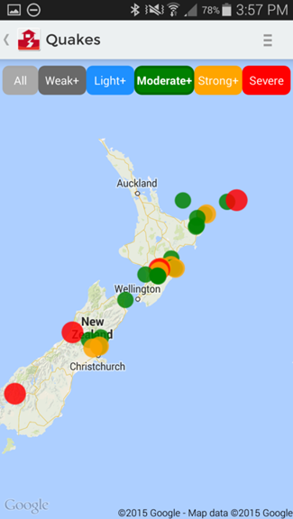
Normal vision of the old rainbow colour palette (unless you are colour blind, then each image pair will look the same). Without knowing, it is impossible to guess if a blue quake is larger than a green quake.
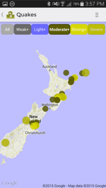
Deuteranopia view. There is no logical progression in the colour scheme as intensity increases. Moderate quakes stand out, and severe quakes blend in with the background map.
Consistent with GeoNet App
The modifications to the website maps have brought them up to date with the app based maps, which have been available on IOS and Android platforms since late 2015.
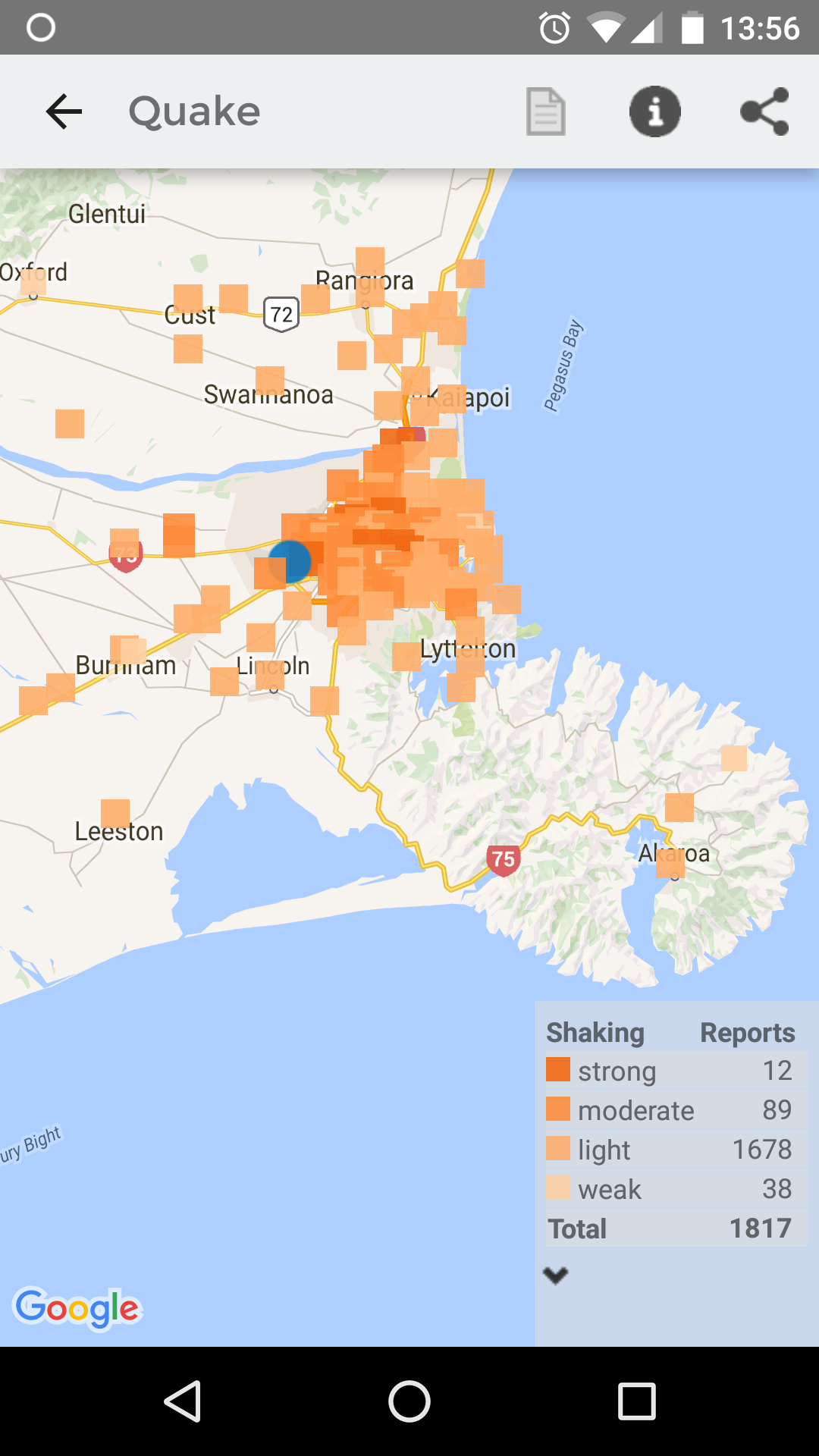
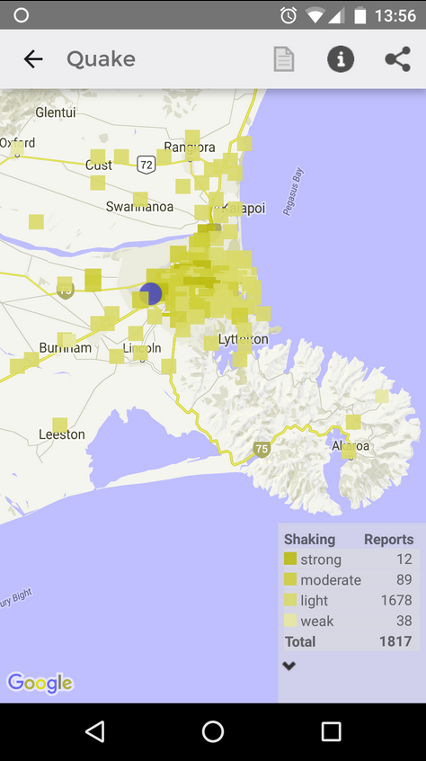
Normal vision of shaking reports from a recent Christchurch 4.1 quake.
Deuteranopia view of the Christchurch 4.1 quake as the app is configured currently.
We prefer to make our changes incrementally so that the changes are not so jarring for you.
We went through a few iterations for fixes, and we're hoping our simple solution makes a big difference. Until now there have been parallel colour coding systems operating whether you were using web or app based GeoNet interfaces. Now, both function as much more streamlined, user-friendly and faster tools.
It’s awesome if you’re already using both platforms, as you will be familiar and the changes will seem less drastic.
We love rainbows too, but so sorry rainbow lovers, you'll have to find bright colours elsewhere, we are staying on the peachy side and sticking with salmon.