
How does the Kawerau earthquake swarm compare with other swarms?
Welcome, haere mai to another GeoNet Data Blog. Today we ask how the recent Kawerau earthquake swarm compares with other nearby and recent swarms.
In the early hours of Saturday 18 March 2023, residents of Kawerau were rudely awakened by a series of earthquakes. The earthquakes were located almost directly beneath the Bay of Plenty town, and many were large enough to felt in Kawerau and the surrounding area. The swarm continued to be very intense for about a week. By the end of that time there had been seven earthquakes larger than magnitude 4, with the largest a magnitude 4.9. GeoNet received more than 2000 felt reports for several of the larger events, with some describing the shaking as “strong”.
Our on-call Seismic Duty Officers (SDO) and Communications Duty Officers (CDO), supported by our National Geohazard Monitoring Centre (NGMC), worked hard throughout the week to keep everyone informed about how the activity was developing.
What's an earthquake swarm?
For those not so familiar with the words we are using, here’s a quick explanation of what we mean by an earthquake swarm. The term “earthquake swarm” is used to describe a sequence of earthquakes that doesn’t include one earthquake substantially larger than all the others in the sequence. At Kawerau, the three largest had magnitudes of 4.9, and 4.8, and a 4.6. They are very similar values, so it qualifies as an earthquake swarm.
The other type of earthquake sequence you might have heard of is a mainshock-aftershock sequence. In that case, one earthquake, the mainshock, is substantially larger than all the others. A good example is the 2016 M7.8 Kaikōura earthquake where the second largest in the sequence had a magnitude of 6.7, substantially smaller.
Earthquake swarms are quite common in Aotearoa-New Zealand, particularly in the Taupō Volcanic Zone (TVZ) in the central North Island. The fact that swarms occur in a volcanic region doesn’t imply they are necessarily due to underground volcanic activity. The TVZ has a lot of active faults and most earthquake swarms there are due to movement of those faults.
How do the swarms compare?
So, how does the Kawerau swarm compare to some other nearby and recent swarms? We thought this would make an interesting topic for a blog because it’s a question we asked ourselves a few days after the swarm started, and at the time we didn’t have a good answer.
We’ve compared the Kawerau swarm with four others, the recent Lake Taupō swarm and three larger swarms in the Bay of Plenty. The Bay of Plenty swarms were in 1998 beneath the Haroharo volcanic centre, about 20 km south-west of Kawerau, in 2004 near Lake Rotoehu, about 20 km north-west of Kawerau, and in 2005 near Matatā, about 20 km north of Kawerau.
We know that just over 1000 earthquakes were located near Kawerau and we want to know if this total is greater than other swarms, in other words, was the Kawerau swarm more active? Counting the number of earthquakes located is intuitively a simple solution but doesn’t always give the most reliable answer. We’ll come back to that in a moment. Here’s what we made to compare the swarms.
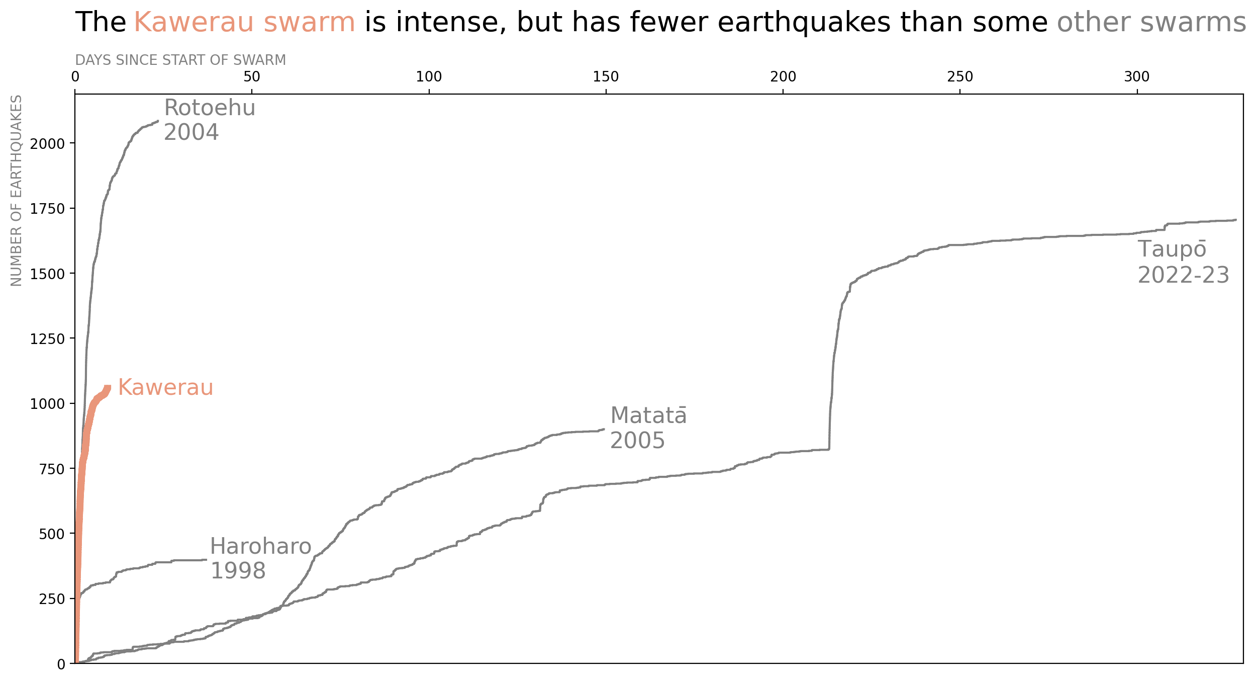
Comparing the Kawerau swarm with three others in the Bay of Plenty, and the recent Lake Taupō swarm. Data for Kawerau and Taupō swarms are up to 28 March 2023.
This might not be the kind of graph you’ve seen before so here’s a bit of explanation. What we’ve plotted here is how the total number of earthquakes in each swarm has grown over time. We call this a cumulative plot, but perhaps a step plot is a better name as it looks a bit like steps on a staircase. If there are many earthquakes in a short time, then there are many closely spaced steps and the staircase rises quickly. If the earthquakes are less frequent, then the steps are spaced further apart, and the staircase rises more slowly. We gave an example of a step plot in our first blog. In that case, steps could go down as well as up, in this case, we are counting how the total number of earthquakes grows over time so the steps always go up. On the horizontal axis we show the number of days since the start of the swarm, so the start of each swarm is in the same place on the graph, and we can compare between swarms more easily. The vertical axis shows the total number of earthquakes.
You can see that the line for the Rotoehu swarm in 2008 rises highest, to just over 2000 earthquakes, making it more “active” than any of the other swarms. The line for the Lake Taupō swarm stretches furthest to the right because it has continued for the longest, over 300 days, almost a whole year. With just over 1000 earthquakes, the Kawerau swarm isn’t the most active, Rotoehu 2004 and Taupō 2022-23 both have more earthquakes, but it is relatively “intense”. By that we mean a lot of earthquakes in a short time and its line on the graph rises very steeply.
Back to the comment we made about number of earthquakes in a swarm not necessarily giving a good comparison with other swarms. The big issue here is that the capability of our seismic network to detect and locate small earthquakes isn’t the same everywhere, and in the past certainly wasn’t as good as it is now. This means that in some places we can’t detect and locate as many small earthquakes as in other places, and overall with time, we’ve been able to detect more and more small ones. By ignoring this issue and just graphing the total number of earthquakes in each swarm, our graph may not allow us to make an unbiased comparison between swarms. The best example of this is probably trying to compare the 1998 Haroharo swarm with the Kawerau swarm. In 1998, our seismic network was a fraction of what it is now and for the Haroharo swarm we were only able to detect and locate a fraction of all earthquakes smaller than magnitude 2. But for Kawerau, with our network being much larger, we can detect a lot more smaller earthquakes. While this might not be the complete reason, it certainly contributes to why the Kawerau swarm has more total earthquakes that the Haroharo swarm.
When we want to compare the numbers of earthquakes in sequences in different places and at different times, we typically try to address this network detectability issue by only considering earthquakes larger than some magnitude. That means all our swarms are on a “level playing field”. So, here’s the same graph as before, but this time only using earthquakes larger than magnitude 3.
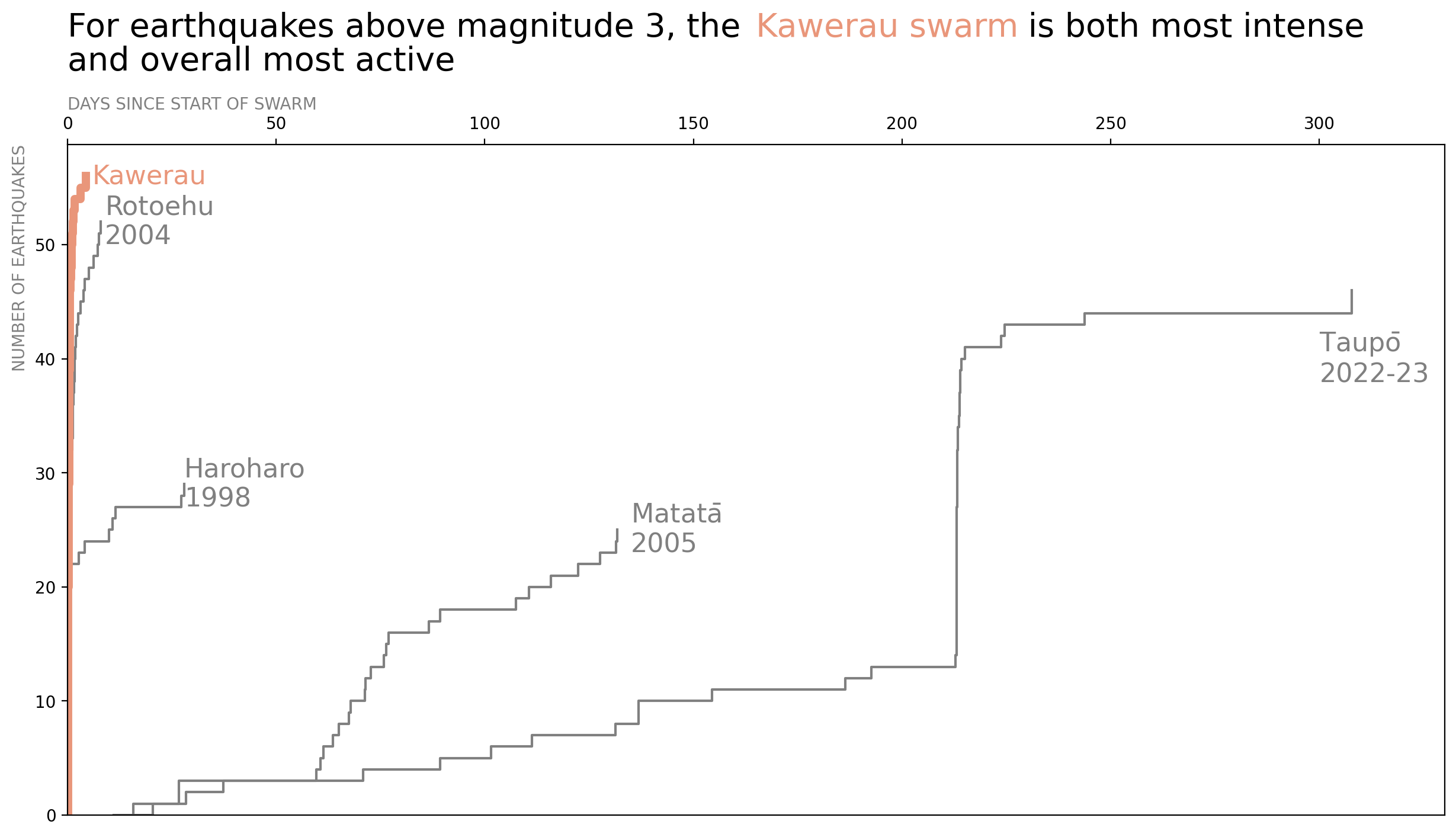
Comparing the Kawerau swarm with three others in the Bay of Plenty, and the recent Lake Taupō swarm, but only considering earthquakes larger than magnitude 3. Data for Kawerau and Taupō swarms are up to 28 March 2023.
As you can see, there are some notable differences from the first graph. What is most interesting is that Kawerau becomes both the most intense and overall most active of the swarms, as Kawerau’s line on the graph rises steeper than all the other lines, and rises to a higher point. That conclusion probably won’t come as a surprise to Kawerau residents who had to endure what must have felt like almost continuous shaking for several days.
For earthquakes larger than magnitude 3, Kawerau’s activity surpassed that of even the 2022-23 Lake Taupō swarm. To give you a better grasp on that, Kawerau had 57 earthquakes larger than magnitude 3 in just over 9 days, while Lake Taupō had 47 in 327 days.
That’s it for now
The Kawerau swarm was certainly very intense, and for earthquakes larger than magnitude 3 was the most active of the swarms we compared it with. It’s interesting how a simple question can bring to light such interesting results if you dig into the data a little.
This blog was completed in early-April 2023, about three weeks after the Kawerau swarm began. At that time, a few earthquakes were continuing in the area, but activity had almost returned to normal. The swarm might reactivate, and other swarms will surely occur at Kawerau in the future. If we think we can show more interesting uses of our data then it’s always possible we’ll revisit this subject in a future blog.
You can find our earlier blog posts through the News section on our web page, just select the Data Blog filter before hitting the Search button. We welcome your feedback, and if there are any GeoNet data topics you’d really like us to talk about, please let us know!
Contact: info@geonet.org.nz